Custom shape properties
As mentioned in the shape behavior, a behavior rule can either refer to a data point property or a shape property.
Shape properties are custom properties that can be defined on the shape definition. After placing a shape on a schematic, the user can set each of these properties to a separate value for each shape instance.
This allows you to create shapes that can be customized without having to create separate shape definitions.
A few examples are:
Shapes with customizable width or height
Shapes with customizable texts
Shapes with customizable colors or icons
Go to the tab Properties to manage the custom properties of your shape.
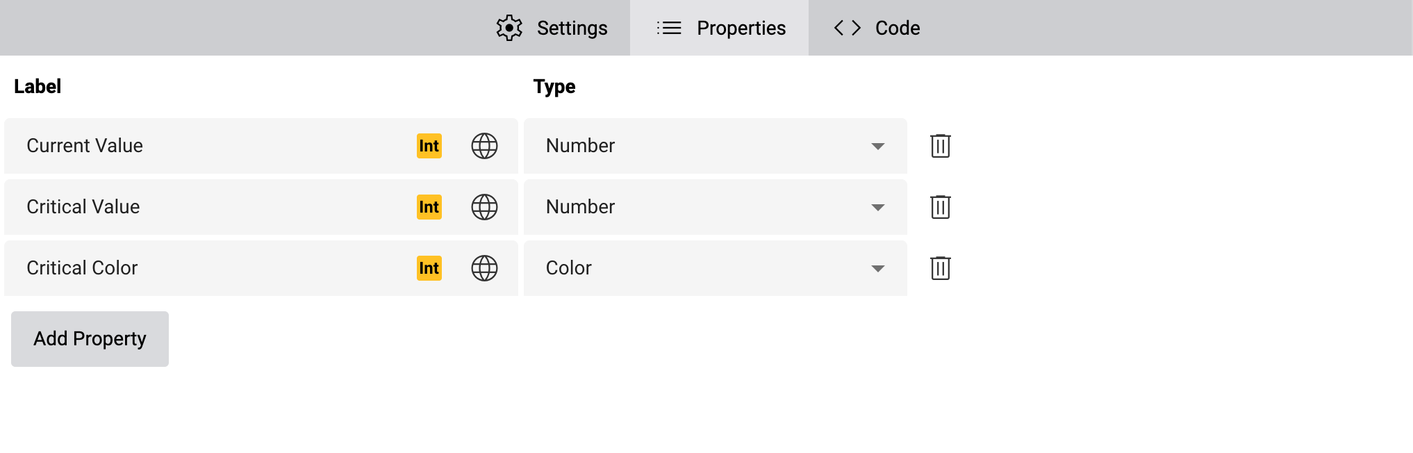
You can add new properties by clicking on Add Property, or delete them by clicking on Delete Property on the respective line.
Each custom shape property has the following fields:
- Label
A localizable label. This label is shown in the Properties sidebar on the schematic where users can set the value of the property on specific shape instances. The label is not used outside of edit mode.
- Type
The type determines what values users can enter for the custom shape property:
Checkbox
The user can toggle a checkbox. This will ultimately switch between two numeric values, 0 (if unchecked) and 1 (if checked), respectively, and those values can be used in conditions like regular numbers.
Color
The user can select a custom color. Use this shape property in combination with the action “Set shape attribute” to drive SVG attributes such as
fill,strokeorstop-color.Number
The user can enter a number. The shape does not differentiate between integer and floating point values, which means you can drive SVG attributes like
font-size,widthoropacity, or use them in actions such as Scale, Translate, Rotate etc.Text
The user can set a custom, static text. This is useful to show custom text in a
<text>element on the shapes, but it can also be used to set the values of SVG attributes directly. For example, if you have a custom shape property for SVG’stext-anchhorproperties, you can allow users to configure it by entering the respective values,start,middleandend, respectivley.Localized Text
The user can set a text in all supported languages. The shape property can then be used to set the text of a
<text>element to the correct translation depending on the current user’s language.Currently, a dropdown selection selecting one of multiple predefined values is not yet supported. To set up a property that can take one of several discrete states, either use Number or Text, and document the supported values. The user will have to enter the correct value corresponding to the desired states. Values of type Text will be easier to recall for users, but values of type Number are more in line with BACnet multi-state objects and require less typing.
Use shape properties in behavior rules
To use a custom shape property in a behavior rule, set the Trigger of your behavior rule to Shape property and then select the shape property in the Shape Property dropdown.
If you want the behavior rule to trigger as soon as the user provides any value for the shape property, set the Comparison to Always. Otherwise, set up a custom comparison. You can find more information on the comparators under Define conditions.