Shape properties
To edit properties of placed shapes, first select the desired shape on the worksheet by clicking on it and then open the Details panel on the right hand side and select the Properties tab.
The different properties of the shape are grouped thematically. Changes are saved automatically.
Shape
The following properties are typically available for all shapes:
- Label
The name of the shape. For some shapes, this text is displayed within the shape, for others it is only used for identification.
- Rotation
Select the desired rotation. A shape can be rotated about its center in 90° steps.
- Rendered Property
For simple data point shapes (that is, shapes to which only a single data point has been assigned), you can determine which property of the data point is to be displayed in the shape or used to change the shape behavior. However, this only affects those behavior rules for which the value <RenderedProperty> has been configured in the Property column.
- Shape Type
Displays the shape type of the selected shape. For simple data point shapes (i.e. shapes to which only a single data point has been assigned), the shape type can be changed at any time.
- System Name
Part of a system name. This is used to automatically fill shapes with data points by searching for data points with matching system names.
Colors
For simple geometric shapes like Line, Rectangle, Ellipse, Polygon and Text shapes, you can also define a fill and stroke color and a stroke width.
By default, the selected colors will be displayed in both light and dark mode. In some cases, however, you may want the color to be automatically adjusted in dark mode to better match the darker color scheme, for example if you use big colored rectangles as backgrounds for your schematics.
To do this, simply set the option Adapt Brightness Automatically to In Dark Mode if you’re currently working in light mode (or to In Light Mode if you’re currently working in dark mode), and the brightness of both the fill and stroke color will be adjusted automatically in that mode.
Specifically, dark colors will be made lighter and light colors will be made darker. The more vibrant or transparent the selected color is, the less it will be affected by the automatic adjustment.
A shape with a fully opaque fill color in light mode. |
Without automatic brightness adjustment: The fill color looks the same in dark mode. |
With automatic brightness adjustment: The colors are automatically adjusted to the respective mode. |
An alternative to this setting is to increase the transparency value of the selected color. That way, the color of the shape will automatically adapt to the respective mode because the background color of the schematic will still shine through and affect the overall brightness of the shape.
A shape with a transparent yellow fill color in light mode. |
The same shape in dark mode without any further adjustments. |
A note on Text shapes
If you place Text shapes on your schematic without setting a specific color, they will automatically adapt to the current mode by default. This mechanism works well if there are no elements with a static fill color behind them. However, if you place Text shapes on top of elements with a static fill color, make sure to set a static color on the Text shape to ensure that the shape doesn’t change to the contrast color by mistake.
Note that Text shapes automatically adapt their color to the current mode by default (top). Therefore, when a Text shape is placed on a bright element like the yellow rectangle in the example above, it might become almost illegible in dark mode (middle). To avoid this, set a static color on the Text shape to ensure that it remains the same in both modes (bottom).
Change colors on hover
If you set a link target on a geometric shape like a Rectangle, Ellipse or Polygon, you can define alternative values for the fill color, stroke color and stroke width that are applied when the user hovers over the shape with the mouse cursor to indicate that the shape is clickable.
To achieve a similar hover effect for shapes inside your shape library, you can either use the “When hovered” trigger to change the color or opacity of an element when the user hovers over it, or you can apply targeted styling to the element with the CSS pseudo-class :hover.
Data point
If exactly one data point has been assigned to a dynamic shape, its properties are also displayed.
- Bus Address
The internal address of the bus object. The format depends on the respective bus type.
- Data Point Type
The type of the data point.
- Decimals
The number of decimal places with which live values are displayed on the schematic or in other widgets.
- GUID
The global, unique identifier of the data point.
- Label
The description of the data point in human readable form.
- Physical Quantity
The physical measured variable.
- System Name
The systematic name of the data point, for example the object code based on the plant identification system (AKS).
- Display Unit
The unit in which the data point is displayed on the schematic or on other widgets.
- Default Unit
The unit in which the device delivers the measurement values.
Link
A shape can also be used to navigate between different schematics or to external web pages when the user clicks on them.
See Links for more information on how to set up links on shapes and the different options for link types and targets.
Assigned data points
The appearance and behavior of shapes can be changed by assigning data points to them. To assign data points, open the Data Point Assignment tab at the bottom and drag data points from the data point sidebar to the desired behavior rule.
The behavior rule is then automatically applied as soon as live values of the data point are received and match the condition of the behavior.
Remove incorrectly placed data points simply by clicking Remove Data Point.
The available behavior rules or data point slots can be edited in the shape editor (see Shape behavior).
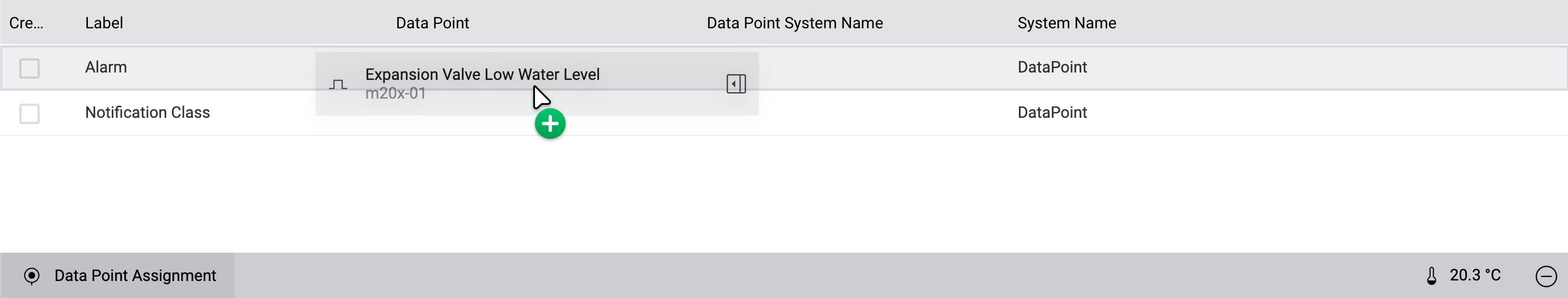
In the Data Point Assignment sidebar at the bottom of the screen, you can assign data points to your shapes, which are then used in the visualization and behavior of the shape.
Note
If the selected shape comes from a master page, you can overwrite any possible data point placements of the master page by simply dragging another data point onto an existing placement. You can restore the placement of the master page by removing the overwritten data point by clicking Remove Data Point.