Ticket statistics
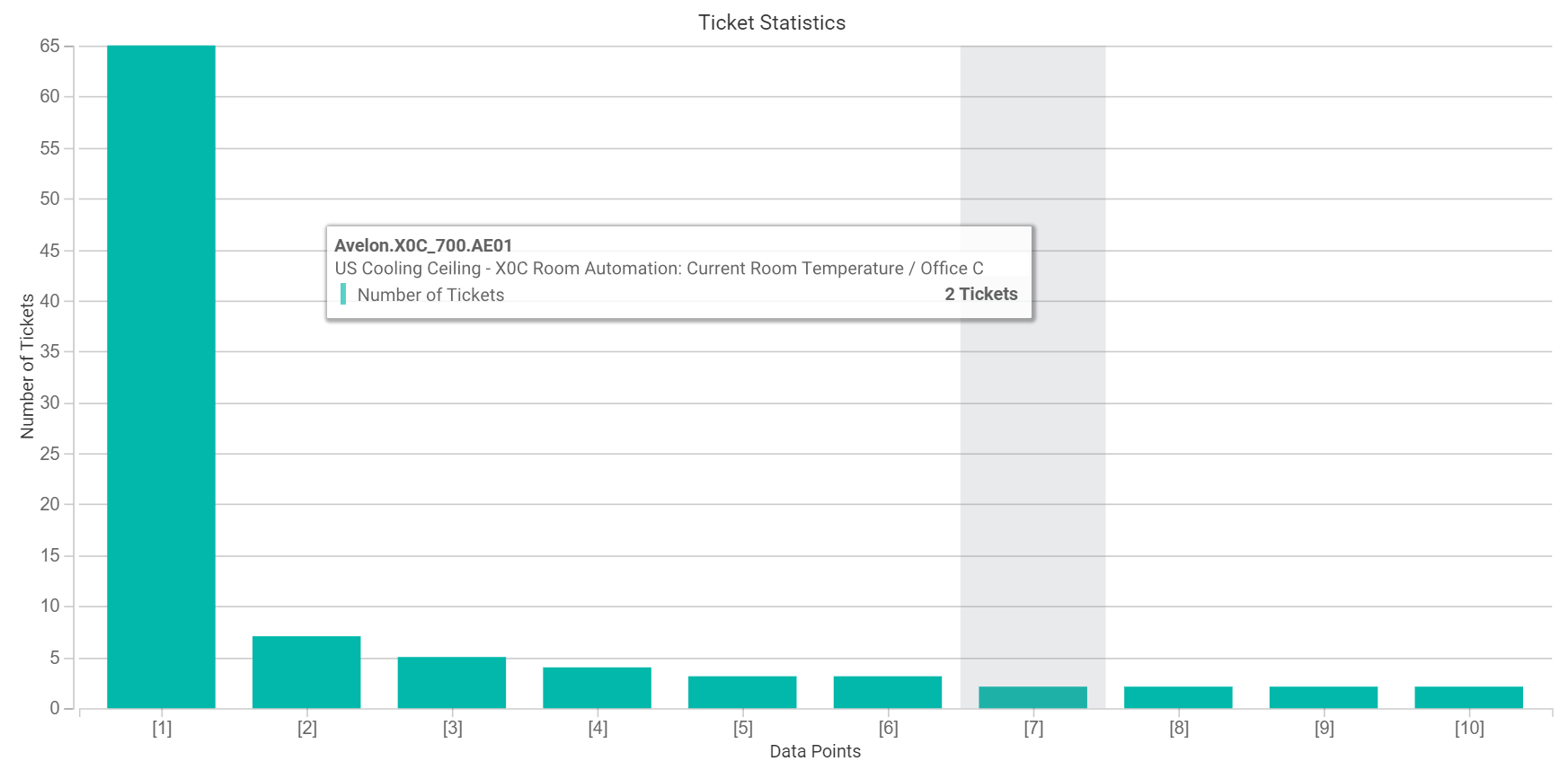
You can use the Ticket statistics chart type to visualize how many tickets occurred in a specified time period and how long it took, on average, for them to be completed.
The x-axis displays a category for each alarm data point for which such statistics are available (i.e. for which at least one ticket was generated in the set time period).
A typical ticket statistic
To set up ticket statistics, proceed as follows:
Create a new plot by clicking the Add Plot icon. Set the desired data function, i.e. whether you want to display the number of tickets or the average handling time.
Repeat this step as often as you like for other data functions or time periods.