Savings gauge
You can use the Savings Gauge chart type to visualize savings targets in relation to user behavior. The user behavior is determined over a defined reference period and corresponds to the data correlation between the variable to be saved and any other variable.
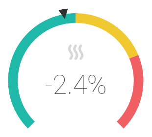
A thermal energy savings gauge with calculated savings of -2.4%, compared to the reference value
The savings are displayed as a percentage in the middle of the level and should ideally be negative. The color scale of the level is determined by the defined target value (e.g. -10%):
. |
Green: The savings target is achieved. |
. |
Yellow: Savings have been made, but the target has not (yet) been achieved. |
. |
Red: No savings were found, i.e. consumption is higher than in the reference period. |
Example: Heating energy consumption
As the outside temperature drops, rooms normally have to be heated more. The heating energy consumption therefore increases as the temperature decreases. This behavior is calculated in a predefined reference interval as a trendline (regression). The savings level now calculates the estimated energy consumption on the basis of this trendline, taking into account the current temperatures. Thus, it is not the absolute energy savings that are calculated, but the savings in relation to user behavior. Therefore, this shows whether the user actually consumes less energy at the same temperatures than in the reference period.
Calculation of the savings meter
The savings meter is calculated as follows:
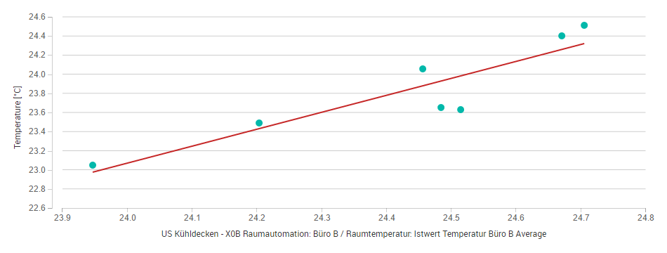
First, the user behavior (correlation or signature) in the reference period is determined. This is determined by the trendline of the configured scatter chart \(→ f(x)\).
The points \((x_i, y_i)\) of the scatter chart in the current time period are then determined. The settings (aggregation, time mask, etc.) are identical to those for determining the correlation in the reference period.
For each value \(x\) in the current period, the reference value \(y_i' = f(x_i)\) is determined based on the signature.
The measurement values and the reference values are added up to a total:
Measurement value: \(Y = Σ y_i\)
Reference value: \(Y' = Σ y_i'\)
The savings in the current interval are the change with respect to the reference value:
\(E = Y - Y'\)
The savings as a percentage are therefore \(e = Y/Y' - 1\).
To be able to calculate the savings, the scatter chart must be fully set up:
Data point for x-axis
Data point for y-axis
Trendline
For more information about scatter charts, see Data point correlation (scatter chart).
Set up a savings gauge
To set up a savings gauge, proceed as follows:
First, configure the underlying data model. This essentially consists of two correlated data points which are plotted on a scatter chart, as well as a desired savings target. For a better view of the data model, click on the Data model tab to switch to the model view.
Drag a data point from the data point gallery to the empty space below the X-Axis heading at the bottom left. This data point serves as the first data point of the data correlation.
Drag a second data point to the empty space below the Plots heading. This data point serves as the second data point of the data correlation.
A linear regression curve is now automatically drawn through the point cloud, which visualizes the correlation of the two data points.
In the action bar above the chart, set the period over which the historical measurement values are to be calculated. This period serves as the reference period with which the current period is compared based on the specified savings target.
In the chart settings, under Target Savings, enter by how much you want the calculated value of the current period to differ from the calculated value of the reference period.
Switch back to the gauge view by clicking on the Gauge tab below the scatter chart.
Set the desired (current) comparison period at the lower right next to the level.
The needle now shows you whether you will achieve your savings target by the end of the current comparison period, provided that consumption remains constant. As long as the pointer is in the yellow area, consumption is lower than in the reference period, but you cannot achieve the savings target if consumption remains the same. As soon as the pointer is in the green range, you will reach your savings target or even exceed it.
Automatic plausibility check
You can define and assign an audit method to a set of meter data points. Avelon Cloud then checks incoming measurements for plausibility, according to the previously selected method. An alarm is generated when the relative deviation of the performance value calculated by the widget exceeds one of the configured thresholds.
Two automatic plausibility checks can be configured:
Pre-alarm
Main Alarm
Both plausibility checks can be configured as follows:
- Upper tolerance
The upper limit of the tolerated value, as a percentage.
- Lower tolerance
The lower limit of the tolerated value, as a percentage.
- Alarm Chain
The alarm chain that is triggered when one of the tolerance values is exceeded.