This chapter describes the different chart types available in Avelon.
To learn how to insert chart widgets into your dashboard, please read the chapter on Widgets.
Introduction
Although the settings and handling differ between individual chart types, all charts can be configured in a similar way nonetheless.
To configure a chart, click on it on the dashboard and then switch to Edit Mode in the action bar at the top, or activate edit mode first on the dashboard and then, on the desired chart widget, click Edit. Both ways take you to the chart editor.
The chart editor is usually divided into three areas: a preview at the top left, the plot and chart settings at the bottom, and the data point gallery on the right.
Chart view
The chart view at the top left shows a preview of the chart. With the tab bar at the top, you can switch between different views of the chart.
- Chart
Shows the chart as it appears on the dashboard. Depending on the chart and plot configuration, the chart may contain a title, a legend and/or plot parameters.
- Measurements
Shows the measurement values of the individual plots in a table. The table can be filtered and sorted. You can also download these measurement values as a CSV or Excel file by clicking on the Download icon in the toolbar above the table and using the corresponding download button in the dialog.
- Data Point Overview
Shows a list of all data points that are currently used on the chart.
For plots with a fixed data point, assigning a data point to the plot will automatically add it to this list.
For plots with a dynamic data source, data points that match the filter criteria must have a valid license before they show up in the list. Make sure your data points have the necessary licenses as described in Dynamic data source.
Note that each plot with a dynamic data source is limited to 50 data points. If this number is exceeded, no measurements will be displayed in the Chart and Measurements tab, even though the data points are listed on the Data Point Overview tab. In this case, make sure to adjust the filter criteria on the plot to reduce the number of data points.
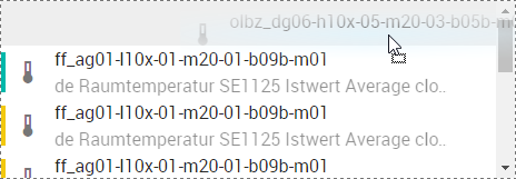
Data points
The data point gallery on the right shows you all data points that have been activated for the current group and serves as a starting point for configuring all chart types.
You can select the desired data point filter in the drop down at the top, and you can search for specific data points in the input field below it. Below this, all the data points found are listed sorted by type. Click on a type to expand the corresponding data point list.
Drag data points from the data point gallery to the highlighted locations on the plot settings to create plots or categories (depending on the chart type).
Drag data points to the plot list to create new plots.
If you want to create a plot with a dynamic data source that automatically picks data points based on some filter criteria, you can do so by clicking on Add Plot in the toolbar in the middle of the screen. Then set the Data Source of the new plot to Dynamic in the plot settings below. You can find more information on how to configure the data source of a dynamic plot on Dynamic data source.
Plot and chart settings
Each chart has general settings that are displayed under Chart Settings. These settings affect the appearance of the entire chart.
As soon as you select a plot, the Plot Settings are displayed instead. You can switch back and forth between plot and chart settings at any time using and respectively.
Note
Plot and chart settings are saved automatically. Manual saving is not necessary.
Date selection
The time interval of the displayed charts can be set via the date selection above the widget. If you change the interval in edit mode, the change is saved permanently. In the view mode, you must select the Set as Default Time Interval icon in order to save it, otherwise the change will be reset to the previous value the next time the page is reloaded.
General chart settings
The following settings are available for all chart types:
- Title
The chart title displayed above the chart.
- Show Title
Shows the chart title above the chart.
- Show Tooltips
Shows tooltips when you move the mouse over the individual plots. The tooltip for data point plots shows both the name and the system name of the corresponding data point. The exact display, however, depends on the settings of your user account. To configure it, click the Show Data Points icon in the data point gallery on the right, and then select the option you want.
- Show Legend in Widget Mode
Shows the legend below the chart when the chart is displayed on the dashboard. The preview that is displayed in edit mode in the upper half of the screen also corresponds to the widget mode.
- Show Legend in Full Screen Mode
Shows the legend below the chart when the chart is displayed in full screen mode. To go to full screen mode, exit the editing mode by clicking the Quit Editing icon at the top right.
- Show System Name in Legend
Shows or hides the system names of the data points in the legend. The data point name is always displayed.
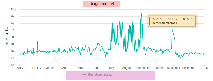
The different elements of a chart: title (red), legend (pink) and tooltip (orange)
- Style
Select the background style. It will automatically adapt to the current theme.
Background styles depending on the current theme Style
Light mode
Dark mode
Default
Semi-transparent
Transparent
Linear gradient
Radial gradient
General plot settings
Many plot settings are available for most chart types and they are described in detail in this section. Further chart-specific settings are described directly in the sections of the corresponding chart types later in this chapter.
- Plot Name
By default, the plot name corresponds to the data point name. If desired, this can be overwritten here. The plot name has no effect on the data point name and is only displayed in the chart.
- Data Source
Only available for the following chart types:
You can choose between the following data sources:
Data point
Dynamic
For more information on how to configure the data source of a plot, see Data source.
- Data Point
This field is only available when Data Source is set to Data Point (see above).
For more information on how to configure the data source of a plot, see Data source.
- Color
The plot color for positive values. The color settings can be further edited by clicking on Color.
- Negative
The plot color for negative values. The color settings can be further edited by clicking on Negative.
- Series Type
Specify how the plot is to be drawn. The following types are available:
Line
Spline
Columns
Scatter
Area
Area Spline
Step Area Center
Step Area Left
Step Area Right
Step Line Center
Step Line Left
Step Line Right
- Stacking
Stacks several plots on top of each other. Make sure that the aggregation interval and the stacking type of all plots to be stacked are the same.
No stacking: Line plots overlap and column plots are displayed side by side.
Absolute: Plots are stacked on top of each other.
Relative: Plots are stacked on top of each other, relative to the sum of their values (= 100 %).
- Line Type
The line style of the plot can be changed for the series types Line, Spline, Area, Area Spline and all Step Areas and Step Lines.
- Line Thickness
The thickness of the line in pixels. Available for the series types Line, Spline, Area, Area Spline and all Step Areas and Step Lines.
- Marker Type
The marker type that is displayed at the individual measuring points:
None
Circle
Square
Diamond
Triangle
Reversed Triangle
- Marker Size
The size in pixels of the marker that was selected under Marker Type.
- Primary Data Function
You can select a function that will be applied to all measurement values of an aggregation interval. Depending on the chart type, the aggregation interval can be set either directly on the plot or generally on the chart. The calculated value is valid for the entire aggregation section.
- Automatic Optimization
Applies an automatic optimization function to the measurement values that depends on the selected time interval. For an interval of one year or longer, for example, hourly averages are calculated automatically. For smaller intervals, a shorter aggregation period is used accordingly, or raw values are displayed.
- Raw
This option is only available for measurement charts. The values are displayed exactly as recorded. However, the maximum number of displayed records is limited to 3000 per plot.
- Average
Calculates the arithmetic average in the respective aggregation interval.

- Maximum
Calculates the highest value in the respective aggregation interval.

- Minimum
Calculates the lowest value in the respective aggregation interval.

- Sum
Adds all values in the aggregation interval.

- Positive Consumption
Calculates the difference between the value at the beginning of the aggregation interval and the one at the end. Only positive differences are taken into account. Negative differences are discarded and default to 0.

- Negative Consumption
Calculates the difference between the value at the beginning of the aggregation interval and the one at the end. Only negative differences are taken into account. Positive differences are discarded and default to 0.

- Positive Consumption (with Reset)
See Positive consumption. If a meter reset is detected, i.e. if the difference between two consecutive values within the aggregation interval is greater than 20% of the first of the two values, all subsequent values are shifted by this amount to compensate for the sudden jump in the measurements.

- Positive and Negative Consumption
Calculates the difference between the value at the beginning of the aggregation interval and the one at the end. Both positive and negative differences are taken into account.

- Secondary Data Function
The values calculated by the primary data function can be further calculated using a secondary function:
- None
No secondary data function.
- Difference
Calculates the difference between a measurement value and its previous measurement value.

- Add Up
Adds a measurement value to the sum of the previous (added up) measurement values.

- Time Offset
Shifts the displayed time interval by this time. This allows you to compare the measurement values of a data point with the measurement values of the same data point from a previous period.
- Time Mask
You can use a time mask to specify that measurement values should only be taken into account and displayed in the chart if they lie within this time mask. This allows certain time periods, such as after-hours or weekends, to be excluded from the visualization.
- Show Parameters
Shows a list of parameters next to the chart. While only the minimum, maximum and average values are displayed in a measurement value chart, other chart types provide much more detailed key figures (for example, the interpolation nodes of trend lines in the Data point correlation chart).
- Separate Y-Axis for this Plot
Normally, plots with identical units share the same y-axis. If you activate this option, a separate y-axis will be used for this plot.
- Hide Y-Axis
Hides the y-axis for this plot.
If there are multiple plots that share the same y-axis, this option needs to be disabled for all of them individually to hide the y-axis.
- Show As Isolated State Timeline
Hoists the current plot up to the top of the chart and displayed it with a separate x- and y-axis. This is particularly useful for binary and multi-state data points to separate them visually from other plots in the chart while still keeping the time axis aligned with the rest of the chart.
- Limit Ordinate Minimum and Maximum
Normally the y-axis is automatically scaled using the displayed measurement values. If this automatic feature is insufficient, you can limit the y-axis section manually. Activate this option and define the corresponding limit values. Measurement values outside of the set value range are cut off.
Duplicate and hide plots
Previously configured plots can be cloned with a click on Clone Plot. All settings are applied. This function is useful, for example, to compare data points with themselves at different time intervals. All you need to do after cloning is set the time offset.
You can temporarily hide individual plots by clicking Hide Plot. The plot is then no longer displayed in the chart until you make it visible again.
Time zones
The time axis of a chart is always displayed in the time zone of the chart, which corresponds to the time zone of the data point (device) of the first plot. Aggregations are always calculated in the time zone of the respective data point.
Chart issues
If the system detects issues with your chart, a warning icon is displayed in the top right corner of the chart. Click on it to show the issues. Typically, issues are caused by plots with a dynamic data source that either filter no data points or too many. In that case, you need to adjust the filter criteria of the respective plots.
The number of data points per dynamic plot is limited to 50.