Chart with aggregation function
You can use the Chart with aggregation function chart type to display recorded measurement values aggregated over time. It is therefore suitable for discrete calculations, such as monthly consumption, maximum daily temperatures or other measurements that you want to display calculated in regular time intervals.
All plots in a Chart with aggregation function have the same aggregation interval. If you want to set this individually for each plot or even combine it with continuous measurement series without an aggregation function, use the measurement chart instead.
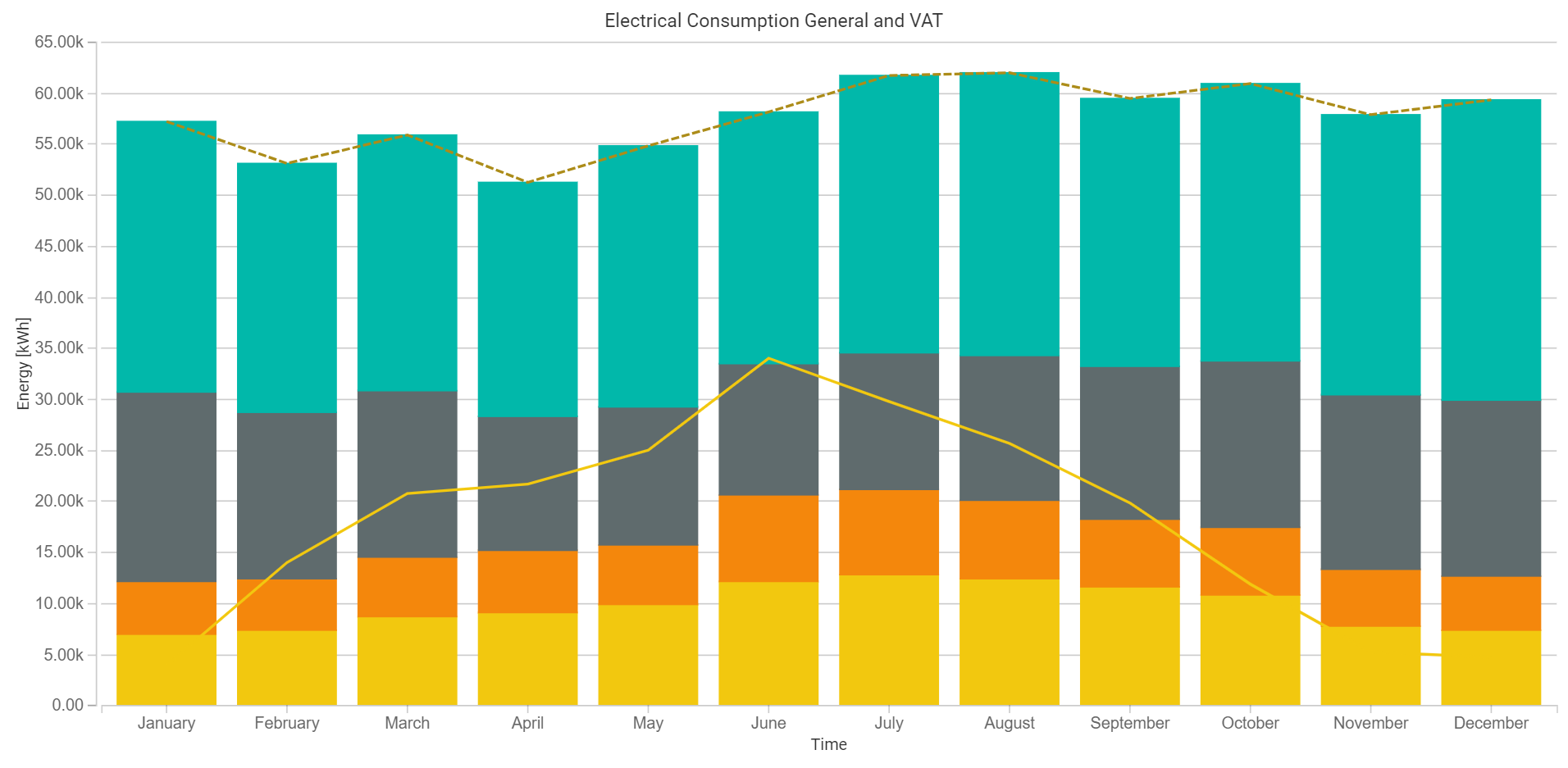
A chart with three differently aggregated data points
To set up a chart with an aggregation function, proceed as follows:
Drag a data point from the data point gallery to the empty space below the Plots heading.
The new plot is selected automatically, allowing you to configure it. For example, change the color or the primary data function.
If measurement data is available for the data point, a preview of the aggregation will be displayed at the top.
You can repeat these steps as often as you like.
Advanced chart settings
In contrast to the Measurement chart, in this chart type the aggregation interval can only be set on the chart itself and is then automatically applied to all plots.
Consumption
For information on calculating consumption, see section Consumption.