Table report widget
With the table report widget, you can create a tabular report of your data points and their measurement or consumption values. You can then embed this table in your reports.
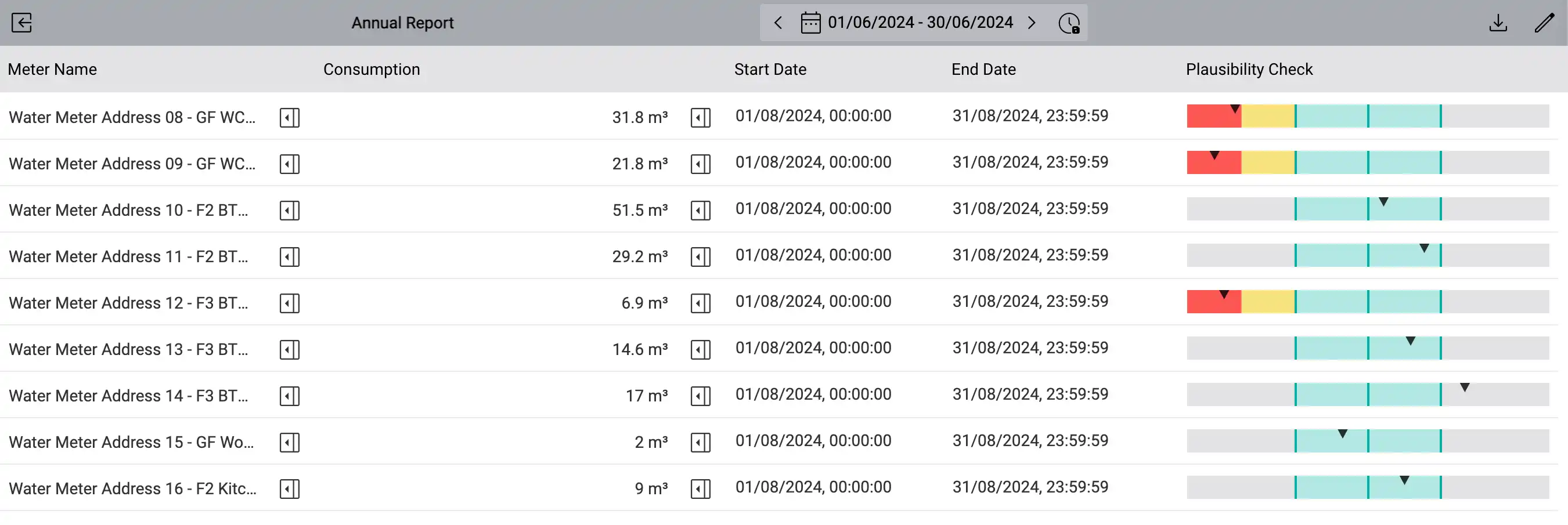
The table report widget with data point designation, system name, measurement value, reference in the time interval and a plausibility check. Each column and, if required, even each cell can be configured individually.
Set up the table report widget
To learn how to add widgets to your dashboards, see the Widgets chapter.
Configure the table reporting widget by either clicking the Edit button on the corresponding widget when in dashboard edit mode, or by clicking Full View to switch the widget to full view and then on Edit to enter the edit mode.
Configure columns
First, create the desired table columns by clicking on Add Column, in the lower half of the screen. Configure the new column:
- Column Name
The column name as it should be displayed in the column header.
- Column Type
The type of data to be displayed in this column.
Depending on the column type selected, additional settings are available. These are described in more detail in the following sections.
In the Columns list at the bottom left, click a column name to display the corresponding column settings. The column settings apply to all cells in the selected column, even if you add rows later.
However, you can also change the column type for individual cells and thus overwrite their column settings. To do this, click directly in the desired cell in the table. The settings for the selected cell are then displayed below the table. Select the Override Column Settings option to overwrite the column settings for the selected cell.
The configuration area shows whether you are currently editing the column settings or the cell settings. If necessary, switch between the column and cell settings with the corresponding arrow symbol above the settings.
- Link to data point details
Next to the data point name, a link is displayed that takes you directly to the details of the corresponding data point. However, the link only appears once you have exited the widget’s edit mode.
Text
You can enter any static text in the individual cells.
Data Point Name
The name of the data point which is currently assigned to a cell is displayed in the individual cells of the column.
System Name
The system name (AKS code) of the data point which is currently assigned to a cell is displayed in the individual cells of the column.
Value (with or without unit)
- Value Function
The way in which the displayed value is to be calculated.
Average
The average of the measurement values within the selected time interval.
Sum
The sum of the measurement values within the selected time interval.
First Value
The first measured value in the selected time interval.
Last Value
The last measured value in the selected time interval.
Positive Consumption
The positive consumption in the selected time interval.
Positive Consumption (with Reset)
The consumption in the selected time interval with resets taken into account.
Negative Consumption
The negative consumption in the selected time interval.
Positive and Negative Consumption
The negative and positive consumption in the selected time interval.
Interpolated Value at Start of the Interval
The value at the start of the interval, interpolated from existing measurements. An interpolated value can only be calculated if there exists at least one measurement before the start of the interval and one after.
Interpolated Value at End of the Interval
The value at the end of the interval, interpolated from previous measurements. An interpolated value can only be calculated if there exists at least one measurement before the end of the interval and one after.
Date of the first or last value in the interval
To display the date of the first or last value in the interval, respectively, select Date of Value from the Column Type dropdown and select the desired value function from the Value Function dropdown.
- Value Function
The way in which the displayed date is to be calculated.
Date of First Value
The date of the first measured value in the selected time interval.
Date of Last Value
The date of the last measured value in the selected time interval.
Start or end date of the interval
To display the start or end date of the selected time interval, select Start Date of the Interval or End Date of the Interval from the Column Type dropdown.
Automatic plausibility check
With the automatic plausibility check, you can instruct the system to monitor the plausibility or credibility of measurements using a comparison period. The expected value for the current time period will be calculated based on the recorded value from the preceding time period (or an averaged value from multiple time intervals that precede the current time period, depending on your configuration). If the currently measured value deviates too much from the expected value, you will receive a notification and see this visually in the Table Report widget.
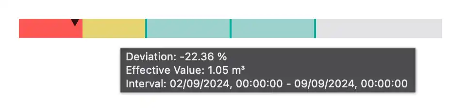
In view mode, the plausibility will be displayed as a horizontal gauge. The little triangle represents the deviation of the current value from the expected value in percent. The colors indicate whether the deviation is within expected limits (green), triggered a pre-alarm (yellow) or an alarm (red), depending on the settings in the section Alerting below.
If you hover over the gauge, you can see the deviation, the current value and the current time interval to which the plausibility check refers.
Note
Note that changing the time interval of the widget in the toolbar has no effect on the plausibility check. The plausibility check will always take the time interval that contains the current date as the basis of its calculation. For example, if you have configured an aggregation interval of one month, the current time interval will be the current month, regardless of whether it’s the 1st or 30th day of the month today.
The plausibility check only works if measurements were recorded in the current time interval and in at least one preceding time interval. Otherwise the gauge will remain empty.
Condition
- Primary Data Function
The function that is to be applied to the measurement values of the comparison period. For a detailed description of each function, see Primary Data Function on the Chart widget.
- Aggregation Interval
The period in which the primary data function is to be applied to the historical values. For example, if you are interested in one aggregation value per day, select Day of Week. For one aggregation value per month, choose Month of Year.
- Compare by Interval
By default, the primary data function is applied to the immediately preceding, next larger time period, i.e. to the last week if you have selected Day of Week as the aggregation period, or to the last year if you have selected Month of Year. When you activate this option, you can increase this time span and include several previous aggregation intervals in the calculation.
- Comparison Interval / Number of comparison intervals taken into account
The period during which the data function is calculated per aggregation period. For example, if you want to average weekdays of the last 4 weeks, select 4 weeks here. If you want to average months of the last 3 years, select 3 years instead.
- Time Mask
To include only certain times in the calculation within the specified aggregation period, you can select a time mask here. Then only measurements within the time mask are included.
Examples
Primary data function |
Average |
Average |
Average |
|---|---|---|---|
Aggregation interval |
Day of Year |
Day of Week |
Weekday of the Month |
Comparison interval |
Years |
Weeks |
Years |
Number of comparison intervals taken into account |
3 |
156 (52 × 3) |
3 |
Description |
The comparison curve is 1 year long and contains 365 values; one for each day of the year, averaged over the last 3 years. |
The comparison curve is 7 days long and contains 7 values; one for each weekday, averaged over the last 3 years. |
The reference curve is 1 year long and contains 7 × 12 values, one for each weekday per month, averaged over the last 3 years. |

Comparison between measurements of a data point (e.g. energy) with measurements from an earlier reference period (e.g. last year), either with or without interdependence with another measurement (e.g. outside temperature)

Comparison between the average consumption of an energy data point with the average consumption from multiple earlier reference periods (e.g. “all Mondays in the last 4 weeks”)
Alerting
- Delay Check
The checking of the alarm condition can be delayed. This is particularly useful if the interval between measurements is greater than the aggregation period. This allows you to ensure that the check is not triggered until all the required measurements are available. Measurements should normally be recorded at least once a day.
- Number of subsequent positive checks until alarm is raised
The alarm can be further delayed by specifying that the alarm condition must still be present after several repeated delays before an alarm is triggered. This allows an alarm to be delayed by several days if necessary.
- Pre-alarm / Main Alarm
To set up a pre-alarm or main alarm, activate this option, select the desired alarm chain to be escalated in the event of an alarm, and set the upper or lower tolerance limit for triggering an alarm if the value exceeds or falls below these. The tolerance entered corresponds to the maximum percentage deviation relative to the calculated value for the comparison period.
Presence Check
- Check for Missing Records
Activate the option, select the desired alarm chain that is to be escalated in the event of an alarm, and set the time after which an alarm is to be triggered if no measurement is available for the current aggregation period. This allows you to check whether your data recording works or whether custom data points are being calculated correctly.
Add and delete rows
After you have created all the columns you need, you can start adding rows. To do this, click on Drop a data point or click here to add a new row. below the table, or drop a data point from the data point sidebar on the right on this area.
Depending on how you configured your columns in the last step, you can now drag data points from the right sidebar to the individual cells of the table to place them there. If you drop the data point on the cell to the left of the first column, the data point will be assigned to all cells on that row.
To move a row, drag the drag handle on the far left up or down. To delete a row, move the mouse pointer to the far right of the desired row and click on Delete Row.
Download data or use it in reports
To download the data from the table report widget, click on Download at the top right.
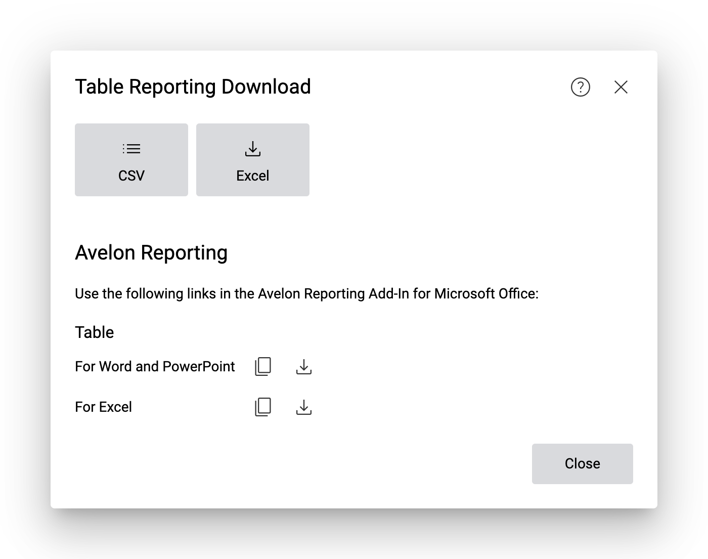
The two large buttons at the top of the dialog allow you to download a snapshot of the current widget as a CSV or Excel file, respectively.
Avelon Reporting
To use the data from the table report widget in your automated reports via Avelon Reporting, click on Copy Link to Clipboard next to the respective option.
- For Word and PowerPoint
This option allows you to insert individual cells from the table report. For detailed instructions, please see Insert field.
- For Excel
This option allows you to insert the data as a table in Microsoft Excel. In addition, you can use Excel’s built-in Power Query feature (“Get & Transform”) to query and transform the data. For detailed instructions, please see Insert table.
Copy URL to clipboard or download file
If you click on Copy Link to Clipboard, only the URL to the table report is copied to the clipboard. You can insert this URL in Avelon Reporting as described above. Each time a new report is generated, Avelon Reporting will evaluate this URL, and the data will automatically be updated with the most recent information from Avelon Cloud.
If you want to see what data is behind the URL, you can click on Download to download the data as an XML file. However, this file cannot be used in Avelon Reporting directly and is only intended for debugging purposes.
Note
Whenever possible, use the Copy Link to Clipboard option if you want to use the table report in Avelon Reporting.
Date selection
The time interval of the displayed values can be set via the date selection above the widget. If you change the interval in edit mode, the change is saved permanently. In the view mode, you must select the Set as Default Time Interval icon in order to save it, otherwise the change will be reset to the previous value the next time the page is reloaded.