Introduction

On the Avelon user interface, individual plants or real estates, but also structural or logical units are organized in a hierarchical group structure. In principle, you are not bound by any fixed specifications, but it is advisable to use a hierarchical structure in which the groups correspond to more and more detailed parts of the plant or real estate as the hierarchy depth increases.

The group structure is the most important navigation tool in the Avelon user interface. Even with a larger real estate portfolio or a more complex technical system, you can quickly navigate to any desired location in your project using the hierarchical structure.

Open navigation

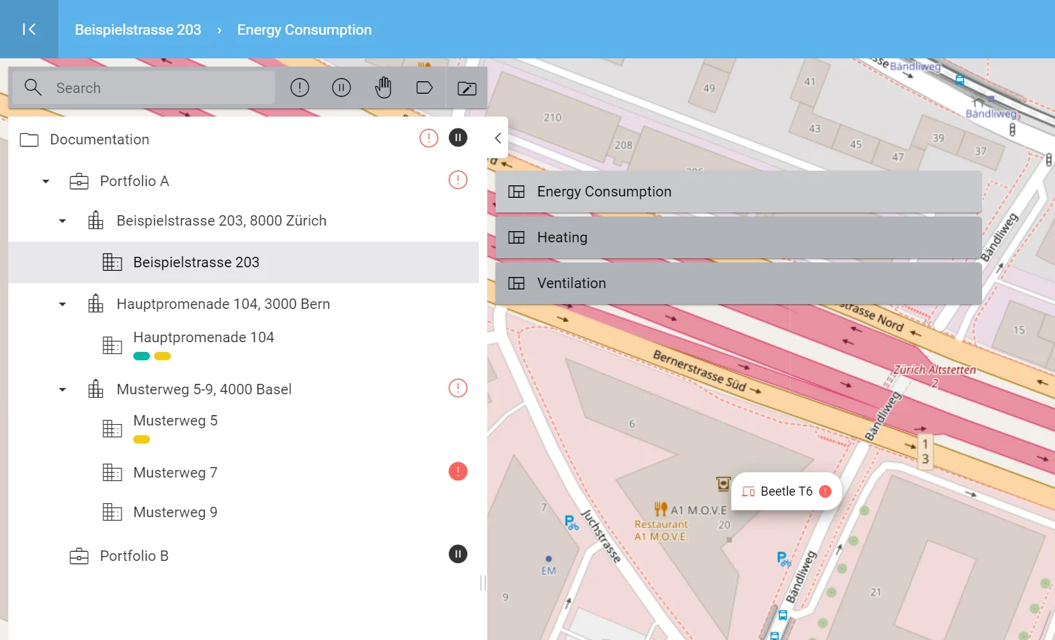
../_images/group-navigation.webp

Navigation view with group tree (left), dashboards (next to it to the right) and map (in the background)

To open the navigation view with the group tree, dashboards and map, click the Show Navigation icon located in the upper left corner of the user interface.

When open, the navigation view can be hidden again by clicking on Hide Navigation.

Click a group in the group tree to select it. The dashboards that are set up on this group now appear on the right side of the group tree. If you click one of the dashboards, you are taken directly to that dashboard and the navigation view closes. Don’t worry, you can open the navigation view again at any time with the Show Navigation icon at the top left, even if you are in the user or device management area.

Once a group is selected in the tree, you can use the Edit Groups menu above it to either edit or delete the group, add a new subgroup, or to create a new dashboard on that group.

Note

There are some specialized group types, each of which supports specific properties.

The default group can be used to structure your portfolio, your building or your plant and break it into smaller components.

Portfolio groups typically contain multiple real estates. Some settings related to ESG/media reporting can be configured on the portfolio.

Real Estate groups typically contain buildings. In addition to the properties of normal groups, real estates can contain a name (if the name of the superstructure deviates from the group name), an owner and an address.

Building groups represent individual buildings that are part of a real estate or other superstructure. They can also contain a name (if the name of the building deviates from the group name), an owner and an address.

Status icons

In addition to the name of a group or dashboard, additional status icons appear as needed to help you navigate to critical systems:

There are data points available that are in the alarm state.

There are data points available that are out of service.

There are data points available that are in manual mode.

Filled icons indicate that the respective data points are located on a widget on that particular group, whereas outlined icons indicate that the data point is located in one of the subgroups.

See Filter groups by status

Group tags

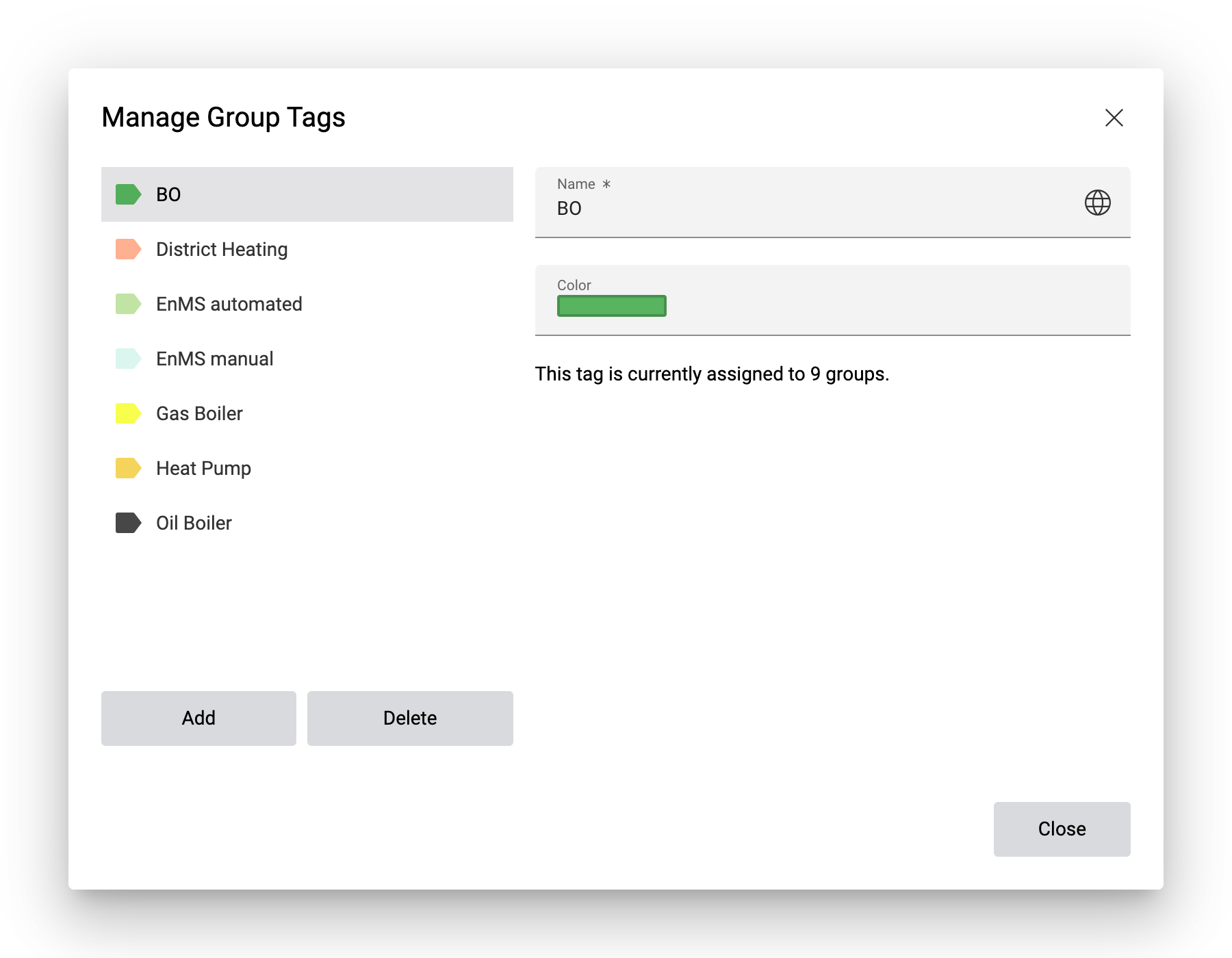
To filter and find groups more easily as your project grows, you can create and assign group tags to your groups.

To create and edit group tags, click on Edit Groups and then on Manage Group Tags. In the following dialog, you can manage your group tags and set their name and color. The name can be internationalized.

Close the dialog after you made the changes. The changes will be saved automatically.

To assign tags to a group, select the desired group and then click on Edit Groups Edit Group. In the group details panel, expand the section Tags and assign tags by clicking on Add Group Tag and selecting the tag you want to assign. Save the changes by clicking on Save at the top right.

See Filter groups by group tags and dashboard categories

Map navigation

For further information on how to navigate with the map, see Navigation by map.

Tickets and data points

With a group selected, additional details about the group appear on the far right hand side.

You can click on the alarm icons to open a ticket list to access all of the tickets that are related to the selected group. For further information about the ticket list, see Ticket list. To configure the kinds of tickets that should be displayed on this ticket list, click on Edit at the top right.

Similarly, you can click on the number of data points to open a list of all data points that are related to the selected group (i.e. which are part of a data point filter that is assigned to the current group). In contrast to the data points list on your devices, this list will show data points across multiple devices. For further information about the data point list, see Data points and data point filters.

The side panel can be resized by dragging the separator on the left. To close the side panel, click on Close at the top of the list. The side panel will also be closed automatically when you leave the navigation.

Note

Changes made on any of these side panels will not affect other ticket lists (widgets) or the data point list on your devices.